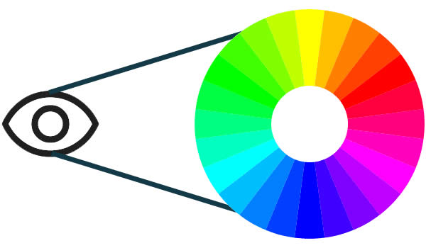
Web designers today must take care to design sites that are accessible to all internet users. A reliable color wheel and contrast checker will help. The W3C stipulates, “Web accessibility means that people with disabilities can use the Web. More specifically, Web accessibility means that people with disabilities can perceive, understand, navigate, and interact with the Web and contribute to it. Web accessibility also benefits others, including older people with changing abilities due to aging.” This means that people reading web pages with screen readers must be able to navigate our web pages, whether personal or business sites. The web is becoming more critical for people from many different walks of life. E-commerce is booming. Secure online banking is the norm these days.
Our pages must accommodate everyone. What a tall order.
Color Wheel and Contrast Checker
Luckily, there are tools on the web to help the discriminating designer create web pages that are both aesthetically pleasing and accessible. The Color Contrast Checker is one important tool. We get instant results. Choose a foreground and background color, and watch as the text on the right changes. Results for those with normal vision is at the top. Results for three different types of color blindness are at the bottom:
- Deuteranopia: an insensitivity to green
- Protanopia: an insensitivity to red
- Tritanopia: an insensitivity to blue (very rare)
Are you coming up with a design and want to test colors before uploading? This is an essential tool for you.
Another critical tool is Vischeck. Already have a working site? Visit Vischeck. Click the first link in the middle of the page to see your site as someone with color blindness sees it. Beyond the Accessibility Color Wheel, Vischeck transforms an entire web page. Having difficulty reading your site as it appears to those with Deuteronopia or Protanopia? Then, it’s time to redesign.
Aside from just doing the right thing, accessibility makes good business sense. The average user makes a split second decision to stay and explore your site, or move on. Build sites that draw visitors and entice them to wait a while.
I commit to ensuring that every site I build is enticing and accessible. The site must shine if the name eNew Park Forest is at the bottom of the page. Accessibility is one crucial brick in the wall.

